skip to main |
skip to sidebar
(Beginning of Challenge) Model Call:
1. Ambola
2. Ana
3. Devika
4. Emily
5. Megan
6. Alyssa
7. Teeani
8. Hollie
9. Sophia
10. Raschell *(thank you!) wipes tears*
Eliminated: Nina
This time we asked you to design an outfit inspired by the 60's mod. Go-go boots, mini-dresses, Twiggy lashes, stick-straight hair, bold patterns, houndstooth, checkers. The sixties for me were all about legs. There were so many great legs in London. It took a certain amount of courage to show them, but it was so liberating. People wanted clothes they could dance in, move in. But make it modern!!! The winner of Project Designer will receive the title of The Next Big DeviantART Designer along with melancholycreations, lashanthao, ladylucrezia, and ceazar. You will receive two interviews with top fashion websites, a mentorship from moi ^^ lol, and their final ten piece collections redone by none other than George Nelson (wakasashe-fashion).
 TOP 3
TOP 3
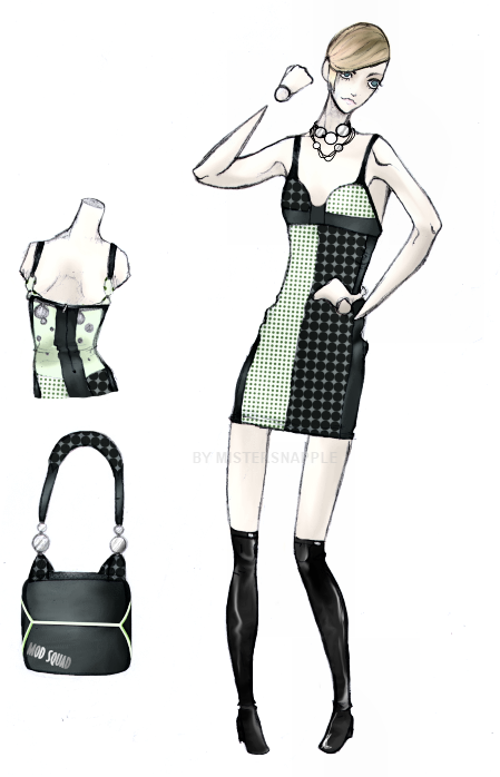
WINNER: mistersnapple What a step up for this designer! Very modernized mod! We still have a basic silhouette that’s becoming his signature, but with this he utilized excellent, bold prints, and fantastic styling. Very retro, but very hip! The shaping around the bust is innovative and fun and the accsessories are perfect!
da-coppa-one One of the judges would have really liked this without the red circle. I understand that she didn't want her design to be boring in black and white, but there are other ways to add pops of color with out making your garment look like a flag. And it really distracts from the details of the garment! Otherwise, everything is perfect A prime example of what the challenge exemplified. I looked at this a completely saw the mod look but also something fresh and unseen before. Very successful! great design lines. Very successful.
lrenah Such a cool interpretation!!! you could see many young trendsetting women wearing this on the streets now! The giant houndstooth is incredible, especially with the delicate attached blouse and the huge belt is an extra cool touch! Irenah really stretched her design talent for me in this one, and it is fantastic for this challenge. Very retro, very now. Excellent work.
IN
HoAcinom A creation that stood out in the bunch. I love the combination of prints, and the coloring and styling were superb. Definitely great to have a more fall/winter piece in this challenge, and the modern look to this gave her high marks. However It's very flowy and airy and not structured like mod dresses. The orange print is nice... But one if us was not sure about the scarf...
linzwinz Very space age! The jacket is so innovative and cool. the almost abstract planet print and cut of the garments are so mod. The seaming details are incredible too! This is something they really played up back then! Nice touch with the background! However one if us wasn’t fond of the print, and overall, though interesting, the jacket isn’t flattering.
Felicidade Very cool! The bubble gum pink paired with blue is nice. the boots are great! Everything is very mod, but I don't feel as though it has that modernized twist to it. This was something very interesting to look at, and I liked the ideas that she came up with. I wish the coloring were more exciting. The 60’s silhouette was captured very well, and I wanted something to make it more now.
ball-jointed-alice Adorable design! The bright color palette and rendering of the print around the pleats of the dress are great! the cut is simple yet very modern, and the proportions are all wonderful!
BOTTOM 3
hallistorkx3 A cute and funky design!! Very playful. The colors are fun. She’s stepping out of her comfort zone with this one, and it’s applauded. I love that a simpler garment was created to utilize the bold print. Very nice. Hallistork had a fairly nice design, but it has a bit of over-design and excess in it. Definitely styled well, and a good look, but some restraint would have been even better.
Kashirohato When I looked at the scores I was like: Why is she in the bottom 3? This would be a cute design if the cut out where maybe a fabric panel. The jacket is adorable. Not sure if we like her choice of prints on this, they make me think of swimwear prints. Who wants a big cut out in the front of their dress bellow their boobs? I DON'T! Infact I don't know anyone who would! However, the purse was GREAT!!!! It does come off as a bit over designed, but the limited palette was a good choice.
OUT: Kallastyos The skirt is too simple. Think about seaming and shapes and darts, because your garments are all looking similar to me now. Also, when designing a jacket which is closed. you really need yo show a flat of what would be worn underneath!! this said, I feel that the whole outfit sort of relies on the houndstooth coat and that the coat's mod feeling relies on the print itself, with the exception of the collar, and for future reference, I think that jackets are right over left for women's clothing. This was a structured piece, but there were some ‘construction issues' and I wish that therewas something more to add interest to the peice. A decent design from Kallastyos, and the dive into digital is applauded. We will deeply miss you.
(Beginning of Challenge) Model Call:
1. Ana
2. Alyssa *smirks*
3. Devika *smiles*
4. Sophia
5. Teeani
6. Emily
7. Megan
8. Raschell
9. Hollie
10. Ambola *claps*
11. Nina *"Thank You!"*
Eliminated: Marla *cries backstage*
This time we asked you to design a cocktail dress(can be floor length) for your model. This one was more about styling than anything else, imitating the style of the classic pin-up girl. She has just become a movie goddess and you need to design her a dress for her debut down the red carpet. The paparazzi was there so her back view should have been as extraordinarily fabulous,as the front. She wanted to look like a movie star from the old Iconic Silver Screen. We told you to think Audrey Hepburn, Marylin Monroe, and Frank Sinatra, but modern as well. The winner will receive the title of The Next Big DeviantART Designer along with melancholycreations, lashanthao, ladylucrezia, and ceazar. You will receive two interviews with top fashion websites, a mentorship from moi ^^ lol, and their final ten piece collections redone by none other than George Nelson (wakasashe-fashion).
 TOP 3 (in random order)
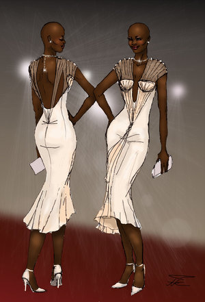
da-coopa-one Another great entry!! Excellent interpretation of the assignment. Before it "went out on the runway" the dress was shortened, and that was a good pay off. I love the drawback to Monroe, and the back is just as interesting as the front. It's wonderful and extremely classic! The cut is great and the garment has been rendered perfectly. The cohesiveness between the front and the back are fantastic. This is a dress that could be worn on the red carpet today or could have been worn as far back as the 40's!! Congrats!!!
ball-jointed-Alice It's become very easy to tell which design is ball-jointed-Alice. This was well thought out with attention to lovely details(the pearls and lace are excellent here). She just handled everything so well. I think it's a gorgeous entry. The soft stripe paired with pink. And the accessories, as always, are lovely and not overwhelming! I would like to know more details about the bow along the edge of the skirt and if it would be a print or an attached bow. We send caution though: While she has an excellent and strong point of view I'd like to see more range. All of her looks so far have a very limited, light pallette. I can't wait to see what else she can do.
Kashirohato wakasashe's favorite and signature designs are in the bust. Here, Kashirohato just blew me away. She created a wonderful, sensual garment both elegant and flirty. I love the look, and her bust fits so well. It's magnificently done. The details are very new and innovative! It looks comfy and functional AND sexy! And those shoes are hot and we especially like the draping in the bodice of this dress. So fun!The back leave more to be desired, but she's definitely showing a LOT of potential.
IN (in random order)
linzwinz Linzwinz really stepped it up for the challenge. I like the print used and the interesting shapes. I do wonder if the silhouette, though pretty, was too simple. A very nice cocktail dress, but a little understated for Hollywood Glamour for me. However, it's a very modern and young design. The incorporation of the jewelry into the garment is very innovative, and it's one less thing you have to buy!!!
Felicidade She created a nice, simplistic cocktail outfit. The problem lies in the level of difficulty she gave herself. The overall look for me was unimaginative, streamlined, and not 'Old Hollywood meets today'. A rather simple design. The gloves and shoes are lovely compliments to the dress but the peachy pink faux fur shawl throws the styling of this off. The back could have had more interest. We don't really see her point of view in this. If you're going to do simple, you are going to have to add a lot of detailing.
HoAcinom Understated color, bold silhouette. We like the balance she/he was able to achieve with this, and the pleating is excellent. We also enjoy the choice of colors. She makes me think of an urban princess or something. Back view is lovely and simple, the cut of the skirt is innovative. Beautiful flowers! I am very happy in seeing HoAcinom's range in her/his designs.
lrenah Very lavish, luxurious..a little over the top...but suitable! It's very current Hollywood glam. We love the styling with this, and her bold colors were so refreshing. While this isn't "technically" a cocktail dress, we think it could work because of the fun punchy colors. and really, there aren't any rules anymore, so it works for me. We love the colors used and the front view of the dress. the back view is definitely sexy. It's modern with a hint to vintage in the silhouette. The only thing we worry about it comfort because of that knot on the one side of the back.
hallistorkx3 I was a little let down by this one. A cute design. A little too simple maybe, but the ability to adjust the skirt adds an extra edge to the design! The back view leaves no interest to me whatsoever, and while the silhouette is very experimental, it a bit maternal. it's cute. i think with a better rendering (ie, making the models legs longer) the dress could have been a bigger success...at least for me.Tthe way it's drawn now, it makes the model look a little squat/stumpy. Not flattering. We love the color(which is becoming your signature) and the neckline however .
BOTTOM 3 (in random order)
Kallastyos Kallastyos fared well this challenge with a very alluring drape in the top and figure fitting bottom. The look was understated beauty. I do wish he'd used a surprising color in this garment...I was reminded too much of his first challenge piece. Another overly designed garment. Two bows on the waistband look awkward and strange. You should pick one place to put one oversized bow. The skirt is also not a bubble skirt at all, rather a simple pencil skirt. the purple accessories are a nice touch. We would have liked to see either the front or the back have the ruffles...but with the over designing, we see desire and potential. He's definitely in in my book!
MisterSnapple Very minimalist. I definitely see an Audrey Hepburn, and it's interesting to see he used a print. I actually think the back view, with its intricate seams is more interesting than the front, however the front is more sophisticated than the back...The colors are off and bland and the cut is boring and the back view isn't very clear without a description. Pull yourself out of boring! You're capable of more, we saw it in the last challenge! You love retro, so utilize that with more details and sparkle.
OUT: Israfel03 This garment was so pretty and familiar. Maybe a bit too familiar. While I liked the look and the bold green...but we've all seen this dress before. Israfel03 did a great job but left out all surprise factor for me. the bow is "different" it's not new..it reminds me of Robert Best's design in the first challenge of cycle 3 of Project Runway (I'm sorry, he was a fav, we remember his stuff)...it not bad. Maybe you subconsciously channeled Robert Best while you drew...who knows? This was a VERY hard decision, and we were so glad you could show us your style, and innovation! Thank you!!!
(Beginning of Challenge) Model Call:
1. Alyssa *jumps up and down*
2. Megan
3. Hollie
4. Ana
5. Teeani
6. Ambola *works the runway*
7. Marla
8. Emily
9. Devika
10. Sophia
11. Raschell *whipes forehead and smiles*
12. Nina
Eliminated: Leah. (She helped Kashirohato win the first challenge...hmm)
This time we asked you to design a swimsuit based upon the classic Vargas girl. This one was more about styling than anything else, imitating the style of the classic pin-up girl. We asked you to try to adapt your photos for the month you are given by either dressing for the weather, or using a holiday falling within your month. You can go with a more modern look, but the feel should have a pin-up feel. This is about being sexy without being slutty. The winner will receive the title of The Next Big DeviantART Designer along with melancholycreations, lashanthao, ladylucrezia, and ceazar. You will receive two interviews with top fashion websites, a mentorship from moi ^^ lol, and their final ten piece collections redone by none other than George Nelson (wakasashe-fashion).
 TOP 3
TOP 3
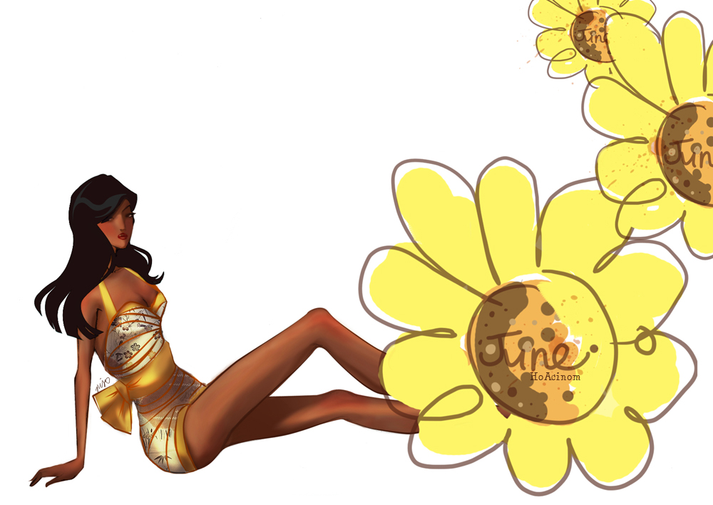
WINNER- HoAcinom- A very sexy and playful suit! The touch of Japanese influence and the color use are beautiful. The color and everything are perfect for the month!My only concern is that if the fabric, which is draped quite nicely in the sketch, were "whatever swimsuits are made of" (which is usually Lycra) this suit may be a bit bulky IRL. But ultimately it was a triumph with her design. She captured the sweet yet sultry Vargas girl exceptionally. The suit was a very clever play on the 40's appeal, with Japanese inspiration as well: a modern inspiration. I loved the colors, the print..everything was great, including presentation.
Ball-jointed-Alice- This is perfect. The suit is the perfect color for January! The middle of winter, the celebration of a new year, each of these things to me tie in with silver and sparkles. the cut of the suit is lovely with a touch of lace and the delicate belt. the accessories are also wonderful, especially with just a few touches for red to make everything pop! The vintage inspiration is apparent, and I could see January right away. Beautiful color palette, and intricate detailing. Bravo!
MisterSnapple- This whole suit is spot on!! the pose, styling, everything. It's very sleek and sophisticated and definitely makes me think of December! The addition of flats is wonderful and the back looks as gorgeous as the front! We loved the pose and presentation of this. Without being overly Christmas-y, this captured the wintry December. Very wealthy, seductive, and well done. A definite improvement from the last challenge! Great job!
IN (Random order)
da-coppa-one- I wish she given a better view of the suit because I can't really figure out what it looks like on a side view and with the cover-up. back and front fashion flats could have helped illustrate the structure. With that said, it doesn't look to have much structure at all! This looks more like a rendition of a Greek goddess with the flowy fabrics, but maybe that's because she had no hair... I do like the incorporation of gold and green to tie the garment into the month of March. I loved this design and the presentation was exceptional, all while capturing the alluring appeal of vintage Vargas.
Felicidade- This is a great piece! The cut of the suit and pose together definitely say Vargas. The colors and incorporation of the month are also very sweet. I like that the colors chosen were not to pastelly Easter. This also makes us think of play suits little girls used to wear. Felicidade was creative in her inspiration from spring, and the basket accessory was a wise choice and the model's pose is both adorable and striking. One of her best presentations to date, and with her design I appreciated the non vulgarity.
Kashirohato- Very stylish suit! I don't personally think of September while looking at this, but I understand the inspiration that she is drawing from. the cut and details are really beautiful and modern. And that halter is very innovative! A design that was wonderfully thought out and executed. All the detailing, texture, and color choices were interesting and fashion-forward. I enjoyed this modern play on the vintage cut of the suit. Aside that I had a hard time seeing September in this, it was exceptional.
Kallastyos- Though the suit is nice (it has interesting details and a nice cut) the styling is off. there's TOO much going on with the accessories! And not well done. The hat seems out of place (and makes me think of Vincent's basket hat), the rope belt is un necessary and and bulky and the clustered pearl necklace that is sitting in the nicely done deep v-neck top that has a broach and trim along all edges AND under the bust, does not do anything to add to this design. Less is sometimes more. You went a bit over board with the extra stuff for a suit that could have stood alone. However, August is a difficult month to work with, and I praise Kallastyos with his approach. I definitely can see Summer with this bold, interesting piece. The nautical theme was appropriate here, and stood out from the rest with the blue stripes.
lrenah- A TWO-PEICE!!!! FINALLY! In the styling, pose, and presentation this was definitely Vargas inspired. The additions in the hair--and even the oversize leaf in presentation--were welcome additions. The look was wonderfully illustrated and executed. the suit is really sexy and the interpretation and inspiration used for this suit are well planned. One of us thought that It says more Vegas then Vargas, but it's beautifully designed none-the-less. the styling and pose are very Vargas though. A definite contender for the win. It was wonderful, and we can't wait to see your next design!!!
Israfel03- A very lovely and soft interpretation of this challenge! Nice layering on the bodice--though it seems there could be more form and compliment to the woman's body. Though it's more literal then some of the other designs, it is done very well. The colors and fabrics are nice and the sheer cover up is beautifully draped. However, we would have wished to see a flat of the swimsuit or something.
BOTTOM 3
linzwinz- I would have liked to see a bit more styling to this, but I still enjoy it. The pose fits with the topic and the suit it's self looks very costumey in a tasteful way. It looks like it'd be a fun Mardi Gras costume! I also appreciate the details of how the suit would be constructed. I appreciated that linzwinz wanted to avoid being to literal with a Halloween theme, but this outfit strayed too far from that idea to
incorporate October. It is a bold decision however, and we respect that.
hallistorkx3- A nice simple suit. the color influences are lovely and work well for a springtime month. The pose is cute, but doesn't say Vargas to me. The simple accessories are a nice touch. A very basic, but not poorly done suit. There is a lot of like about this: the color combination and bust are nicely done. The pose could have been more imaginative..if I didn't know this was a bathing suit I would have guessed it was a dress. I see the month of May; I would have liked to see more Vargas inspiration.
OUT-dacendaren- Though the influence if the month are very well used, this suit is a bit to simply rendered for the amount of detail described. It also doesn't have that 'sultry' look that Vargas girls have. this might have been fixed if the pose were different. We was a little let down by this because it had so much potential. The interpretation was such a strong one and I applaud the decision to exclude the predicted red. The purple detail was absolutely fantastic for me, but dacedaren stopped there. With out that detail on the bust, we would have a plain suit. I just wish that idea was incorporated into the garment as a whole. The presentation was decent; I had a hard time seeing the pose as Vargas. We're sad you were eliminated, but we hope to see some more challenge designs from you! Thank you for competing!!!
 TOP 3
TOP 3
WINNER: Kashirohato-
You really know how to accessorize! Great balance of fun, color, and friskiness. It's very post-modern...vintage style! not only did she perfectly abide to the rules, she also made a garment that is very pleasing and wearable. the over-all presentation's a killer! This outfit definitely embodies the challenge. The jumpsuit is edgy, 'frisky' and extremely feminine! The almost 'Victorian' styled cut of the blouse paired with the modern bottom are wonderful and the pose and accessories add so much to this design. the movement of the illustration just adds to its playfulness! We just wish that you would have edited the bust..it seems a bit unflattering. But other than that, this is a knockout!
ball-jointed-Alice-
She didn't really abide to the rules, where only cotton should be used for the garment...i see gray linings/ribbons...otherwise, we adore this outfit. It's playful, sexy, cute and feminine. The draping of the entire outfit is gorgeous and gives the design a wonderful couture feeling. Since the whole illustration is so well-rendered, we can picture it with fewer trims and the outfit would still be beautifully draped and sexy. Fantastic job!!!
Kallastyos -
Though frisky, the only part of this that would work IRL is the skirt, which is beautifully draped and lovely unless you had a degree in couture sewing...or a seamstress to do it for you. We can see what you were trying to do here, but it's not done well. The shorter sleeve would not stay anywhere and the model would have a wardrobe malfunction... There needs to be a strap or the sleeve needs to sit on the edge of her shoulder. Otherwise, it just would not work...unless it was glued to her shoulder. However, the fabric was brilliant, and the styling was superb.
IN
da-coppa-one -
We really like the idea of this woman being a frisky drummer and love the cut of the top. Though it looks like she could be wearing the dress backwards, it still works very well. The bottom of the top on the other hand, is not terribly creative or flattering. Even with the hot pants underneath, it cheapens the outfit quite a bit. We love the bag and wish that the ribbons on the boots were the same fabric. I also would have liked to see the boots rendered better. She describes them as being 'laced' by having the attached ribbons wrapping around the boot, but the ribbons look more like bulky strips of fabric. This design went a little over the top. The use of multiple accessories stand out, that they hide the entire white garment, as if over-shadowing it...those knots on the bottom are very scary...the accessories are over-used...some incorrectly...i understand that it deals with personal style, but one should consider the beauty of the work while still sticking with the direction...We DO see frisky but...we don't find this beautiful.
Felicidade -
A lovely outfit but it does not look like a suit to me. Nonetheless, it is a garment that not only followed the said direction, but also considered beauty and appeal. The corset and blouse look like they are one garment with an undershirt. The shorts paired with the knee-high boots are the only part of this that really embody the word 'frisky' to me. If the cut of the blouse were more interesting and the sleeves shorter, this would have worked much better. We really hope to see more from you.
linzwinz-
A fun and simple outfit, but maybe too simple. This aside, it still looks very 'in', especially paired with the thigh high boots! We wished that there was more styling to the the outfit...it was a little plain. The challenge was called Plain and Simple, but I didn't mean for you to take it literally! If there might have been more seams or interesting cuts which you are known for, it would have looked a ton better.
lrenah-
A gorgeous lingerie gown! The drape is lovely but one of us would have liked to see the sheerness of the dress rendered more clearly with pale hints of skin tones where her legs are. That would have given the illustration a much more sensual feeling. I'm loving the collar! This also reminds many of us of the lingerie as daywear challenge in cycle four. This would have fit into that challenge perfectly.
israfel03 -
I loved all the detailing and texture. Nice proportion. It was a fairly good design, however, I get more 'demure' than 'frisky'..there is also no evidence of accessories, which should have been utilized in this challenge.
Bottom 3
MisterSnapple -
We think there's a point of view...but I'm not sure. Though it's an understated garment there is a lot going on. I see glamour and sophistication. However...the execution is done poorly...the length of the slit almost exposes the undergarment. I understand that he was trying to boost the sexiness of the dress, but since the skirt is so narrow and the top is low-cut, a slit was not needed. I loved the jacket though and would have liked to see it paired with the dress on the model. It really could have been edited to make the whole look more cohesive, and above all, "frisky." (The cut and the pleating would not work if they were done in a cotton jersey)
HoAcinom-
We really enjoy the illustration style, but the hair has us baffled. And the drape and cut aren't terribly flattering. If it were cut to fit the torso and hips a little more snugly, it could work. The hairstyle is bizarre.....but definitely signature. We want to see more.
hallistorkx3-
A very adorable dress that embodies the more playful side of the word frisky. It has an interesting cut to the bodice and paired with red accessories, it just pops! I don't know how we feel about quilting in the bodice though, especially around the chest area. We imagine it making the garment a bit bulky because of all of the extra seams.
OUT:
mocoloco
red-spot
New Designer:
dacendaren
 TOP 3
TOP 3